


[ 3 minutes reading ]
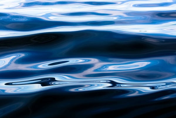
The American colour company Pantone has chosen "universal favourite" Classic Blue, Pantone 19-4052, as its Colour of the year for 2020.
A timeless shade of Blue, PANTONE 19-4052 Classic Blue is elegant in its simplicity.
Announced 4 December, the Classic Blue colour is described by Pantone as "a reassuring presence instilling calm, confidence and connection". With this announcement, Pantone has hopefully set the tone for a peaceful and productive 2020. We’re excited to see what this color will bring into your life.
The 2019 colour of the year, Living Coral ( embodied our desire for playful expression), was a bolder and vibrant choice while the 2020's shade is a more safe choice but that brings a sense of peace and tranquillity to the human spirit, offering refuge, according to the company.
Yes, this is a safe color choice but I also think that Peace and Tranquillity is what we all need for 2020.
"A boundless blue evocative of the vast and infinite evening sky, Pantone 19-4052 Classic Blue encourages us to look beyond the obvious to expand our thinking; challenging us to think more deeply, increase our perspective and open the flow of communication," said Leatrice Eiseman, executive director of Pantone Color Institute.
Pantone’s choice of Classic Blue for 2020 has a longer story behind. The history of the Color began 20 years ago in 1999. That year, the color chosen was Cerulean, a serene shade that represented the excitement of a new millennium and offered a calming visual.
Cerulean was very popular back in the days. This colour became part of the pop culture and not only of the fashion industry in 2006 in a movie with Meryl Streep as Miranda Priestly called, The Devil Wears Prada.
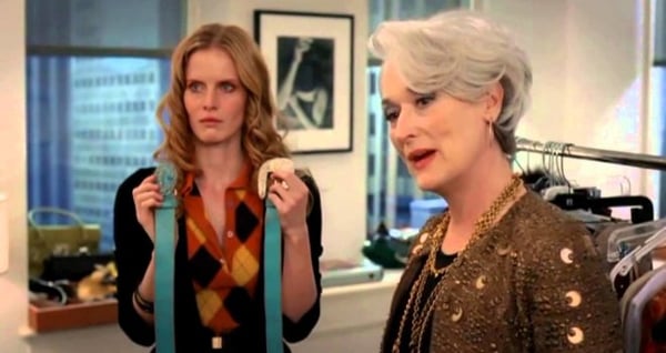
"However, that blue represents millions of dollars and countless jobs, and it's sort of comical how you think you made a choice that exempts you from the fashion industry when, in fact, you're wearing a sweater that was selected for you by the people in this room from a pile of stuff."
In this quote she breaks down how the color became popular globally and how it dominated the fashion industry.
No one can escape from fashion trends!
But why the Classic Blue has a deeper meaning?
In 1999 we were looking for a fresh start and a new beginning with the new millennium and this is what we are still looking for in 2020, 20 years later.
We hope that this color and what it stands for, inspire us all to live better, aware that peace and serenity are the things that really matter for this new decade and beyond.
Hope the Classic Blue will bring us good luck.
For over 20 years, the Pantone Color of the Year has influenced product development and purchasing decisions in different industries, like fashion, interior design, industrial design, product packaging and graphic design. The choice of the color of the year is the result of careful evaluation and analysis of trends.
Do you agree with the choice they've made over the last 10 years? Which one is your favourite?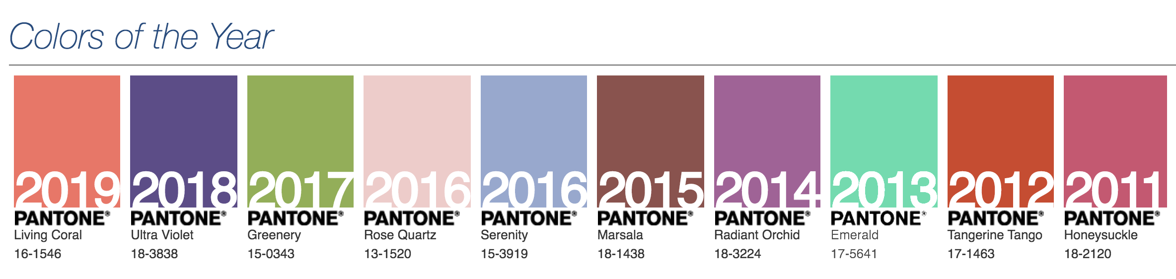
Let us know in the comments below.